For the second round of peer reviews, I will be taking a stroll through Joie Marin’s blog. Joie’s blog is a tiny book nook tucked away in a corner of the web where she discusses books and related topics. For this peer review, I will be taking a look into the design decisions made regarding her blog and what sort of impact it may have on its visitors.

Thoughts
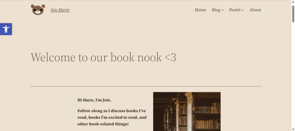
As soon as I enter the blog, I am greeted with the subtle gaze of a gentle beige background and a serif font. Immediately, my first thought is “Yup, this looks like a book blog.”
The colours and typeface used matches the theme of a book blog perfectly. The contrast between the background colour and text colour is balanced enough such that the text is legible, while also being able to act as a stylistic aid to the blog’s theming.
Given that Joie uses an image as part of her post header for each blog entry, the use of a two-column layout is well suited for the blog’s front page.
The site structure is laid out in a simple manner that is intuitive for new visitors. The navigational links and dropdowns allow visitors to easily find the type of content they’re looking for.
Critique
Although there are two areas of the blog that I would want to discuss. One of them being the sizing of the image in the post header.

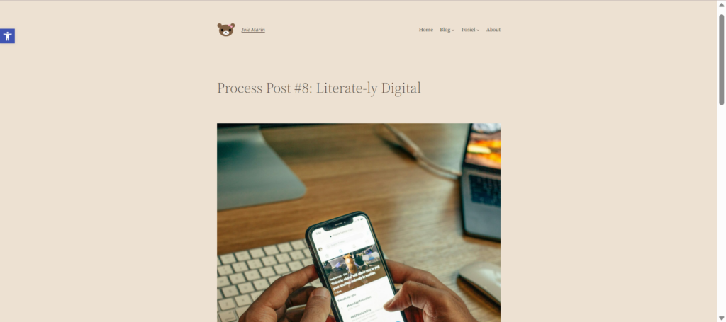
The screenshot shows how a post is viewed at 50% zoom on a 1280px wide display. The size of the post header image is quite large and requires visitors to scroll down almost a screen’s worth of height to reach the post content.
This can be a deterrent for visitors as it may make the experience of reading posts feel cumbersome. As a result, it would be helpful to impose a size restraint on the image based on its height.
The second area I want to discuss is actually on the front page.

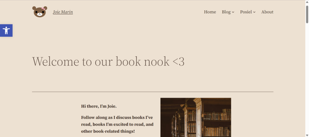
One thing that stood out to me was the welcome message heading and the blog description. The heading uses a light font weight while the description uses a bold weight. To me, this seems unusual because it clashes with the convention of hierarchy.
The light weight on heading makes me think that I shouldn’t be focused on the heading, but rather the description that is written in bold. Which is opposite of the usual process of focusing on the header first, then the description.
Conclusion
Overall, the layout, colours, and text styling compliment the theme of a book blog. It shows careful consideration in finding a medium between visual appearance and site usability.
Although there may remain areas of the blog where the design can be iterated upon and improved, it doesn’t detract from the fact that this blog was designed and laid out with thoughtfulness in mind.

Leave a Reply